Untitled design 11 1

How to Match Paint with Architectural Style

All Images Courtesy of Benjamin Moore

Quick Summary (For Skimmers)

To match paint with architectural style, first identify your home’s design type is it traditional, historic, rustic, or modern? Next, follow the style’s natural cues: ornate Victorians thrive on layered palettes, Craftsman homes look best in earthy, natural tones, and sleek modern builds benefit from crisp, restrained color schemes. Balance authenticity with personality choose historically appropriate shades or palettes that highlight proportions, then add individuality through accents like doors, shutters, or trim. The goal is harmony the paint should enhance your home’s design, not fight against it.

Untitled design 10 1
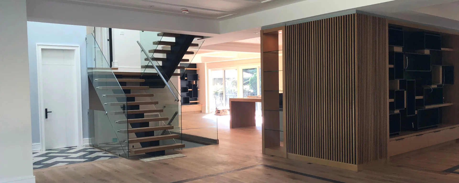
Why Paint and Architecture Must Work Together

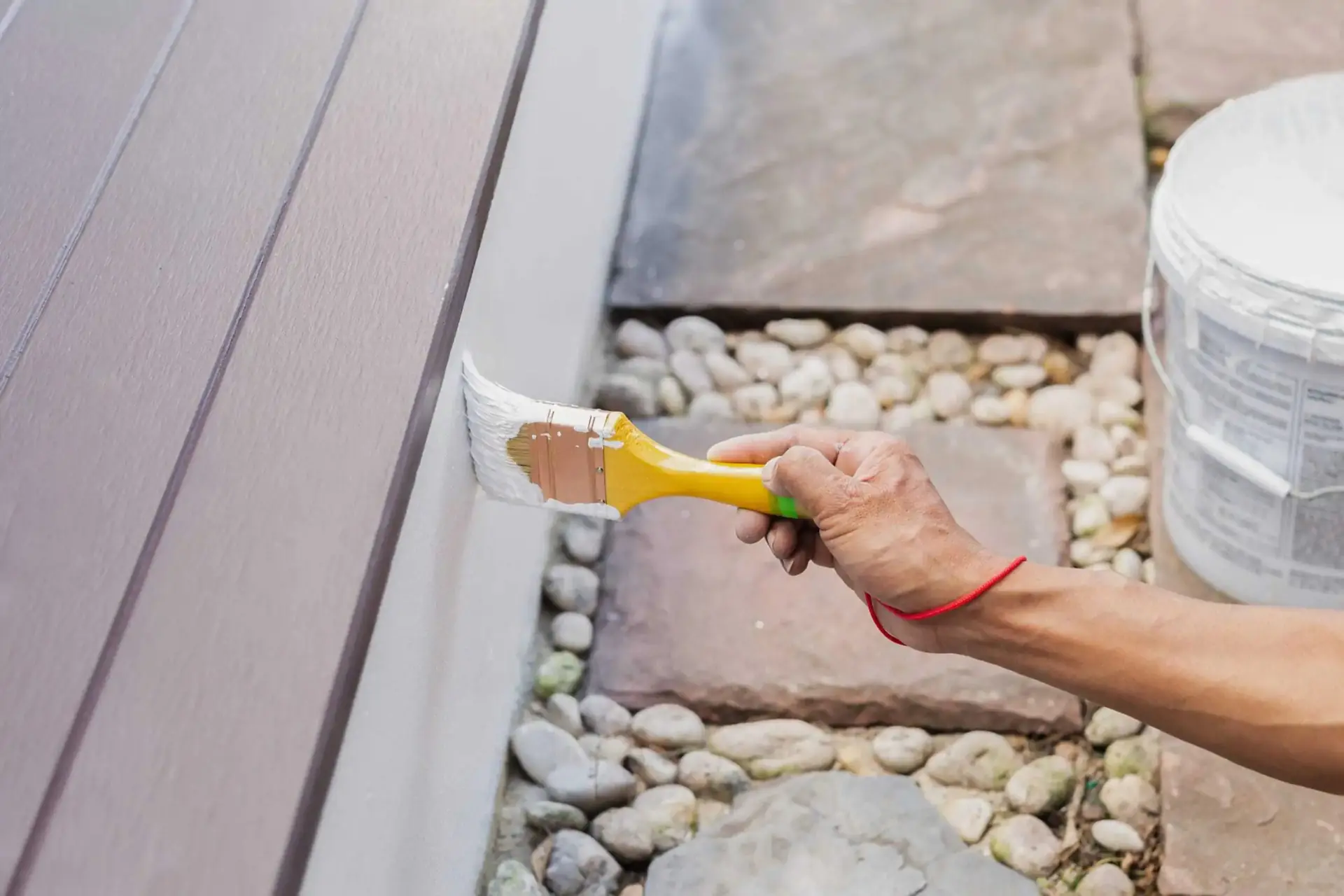
Paint is often called the “skin” of a house it’s the first thing people see and the protective layer that keeps everything beneath safe. But beyond function, paint defines how architecture is read.

  • Proportions: Light and dark shades can visually change height, width, or depth.

  • Features: Trim and accent colors highlight details or, if poorly chosen, drown them out.

  • Style Integrity: Certain palettes naturally “belong” to specific styles. For instance, neon green on a Tudor feels jarring, while muted stone tones feel right at home.

When color and architecture align, the result is a home that feels cohesive, authentic, and timeless.


Traditional Homes: Timeless and Refined

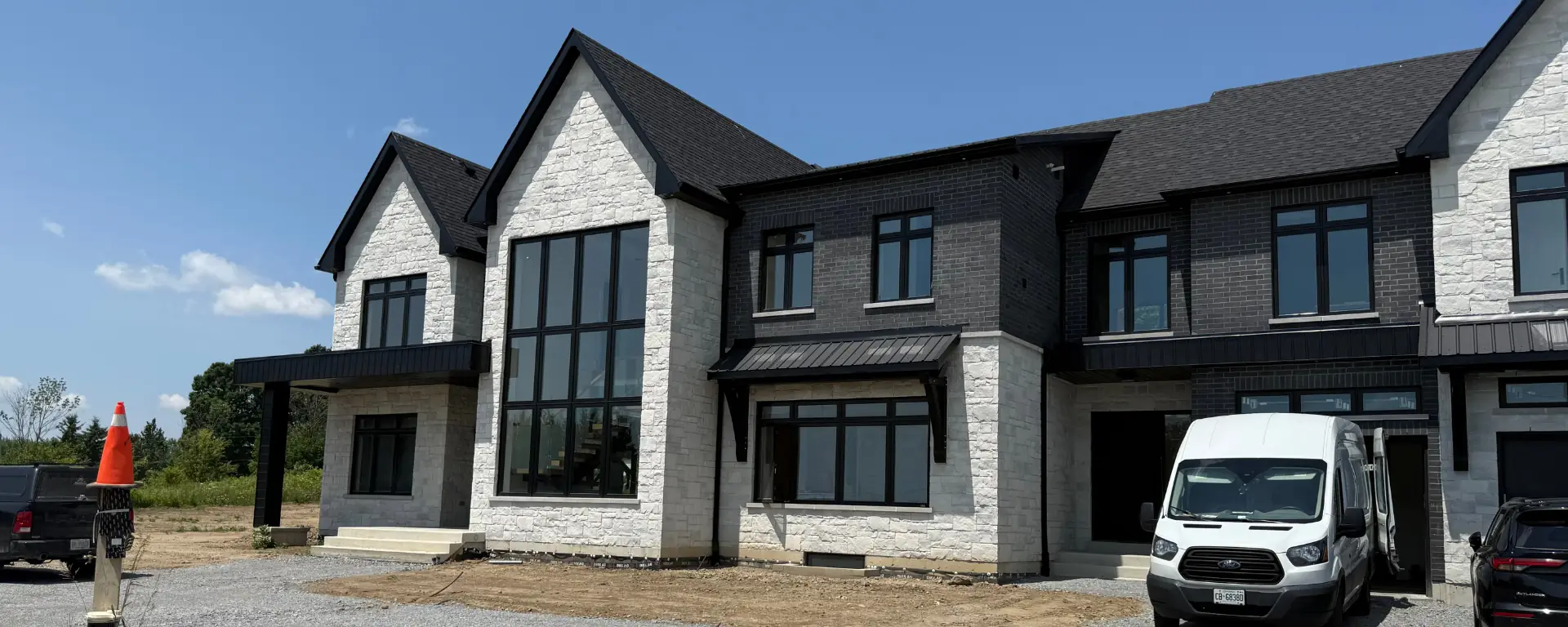
Colonials, Georgians, and Tudors are defined by balance and symmetry. Their paint schemes should reflect that restraint.

  • Colonials: Historically, Colonials were painted in light neutrals with contrasting shutters. Today, crisp white siding with black, navy, or forest green shutters remains the gold standard. Muted greys, taupes, and creams also suit Colonial forms beautifully.

  • Tudors: With exposed beams and stonework, Tudors thrive on earthy palettes. Cream or beige walls paired with deep brown beams look authentic, while accents of moss green or burgundy highlight details without overpowering.

👉 Tip: Keep the body of the house neutral and let accents (doors, shutters, trim) carry personality.


Victorian Homes: Ornate and Playful

Victorian homes are known for their decorative trims, bay windows, turrets, and gingerbread details. Unlike simpler styles, they can handle layered color palettes.

Traditionally, Victorians featured three or more coordinated shades:

  1. A main body color (often muted pastels like sage, dusty blue, or soft rose).

  2. A trim color (cream, ivory, or another muted shade).

  3. An accent color (burgundy, deep green, or gold) to highlight ornate details.

Modern interpretations sometimes lean into jewel tones emerald greens, royal blues, or rich purples to celebrate the drama of the style. The key is celebrating the ornamentation with intentional color variety.


Craftsman and Bungalows: Natural and Earthy

Craftsman-style homes (popular in the early 20th century) were designed to blend with nature. With exposed rafters, wide porches, and wood detailing, they look best in organic, earthy palettes.

  • Body colors: Olive greens, warm browns, muted golds, or clay reds.

  • Trim: Natural wood stains, warm creams, or darker shades of the body color.

  • Accents: Deep red, burnt orange, or moss green doors bring personality while respecting the natural aesthetic.

👉 Tip: Pull inspiration directly from the landscape think “forest palette” or “stone palette” for the most authentic look.


Mid-Century Modern: Sleek and Minimal

Mid-Century Modern homes, popular in the 1950s–60s, feature flat planes, large glass windows, and clean lines. They shine with streamlined, high-contrast palettes.

  • Exteriors often mix white, grey, or beige with natural wood and bold pops of color (like teal, orange, or mustard).

  • Interiors thrive on neutral backdrops with bold accent walls or colorful built-in features.

Because the architecture emphasizes simplicity, paint should support not distract from the design. One or two bold elements paired with restraint is the recipe for success.


Contemporary and Modern Builds: Bold but Controlled

Contemporary homes use steel, glass, and concrete with sharp lines and minimalist layouts. Their palettes are usually monochromatic and dramatic.

  • Body colors: Crisp whites, soft greys, or deep charcoals.

  • Accents: Bold but restrained like black trim, a fire-red front door, or a feature wall in a strong hue.

The aim is clarity and precision. Too many colors can break the clean aesthetic, so focus on contrast and simplicity.


Farmhouse and Rustic Styles: Warm and Inviting

Farmhouse and rustic style homes should feel welcoming and authentic.

  • Farmhouse: The classic look is white siding with black trim, sometimes softened with natural wood tones. Muted blues and greys also work for a more updated look.

  • Rustic cabins or barn-style homes: Deep reds, browns, and greens blend beautifully with wood siding and natural landscapes.

The palette should always support the textures wood, stone, and metal rather than competing with them.


Mediterranean and Spanish Styles: Sun-Washed and Rich

Mediterranean style homes, often with stucco walls and terracotta roofs, call for warm, sun-baked palettes.

  • Walls: Creams, sand tones, or warm peach.

  • Trim: Earthy browns or deep, cool greens.

  • Accents: Rich blues and terracotta reds for doors, tiles, or shutters.

These homes feel most authentic when their paint reflects the landscapes of Southern Europe warm, natural, and slightly rustic.


How to Bring It All Together

No matter the architectural style, professionals follow the same process:

  1. Identify the home’s character is it ornate, simple, rustic, or sleek?

  2. Choose a main body color that supports that character (earth tones for rustic, neutrals for traditional, restrained palettes for modern).

  3. Select trim and accent shades to highlight features, staying true to the architecture’s intent.

  4. Balance authenticity and individuality stick to palettes that enhance the design, but personalize with doors, shutters, or accents.

Untitled design 14 5 1

Paint is more than decoration it’s how a home communicates its style. The right palette enhances proportions, celebrates details, and connects the architecture to its environment. Whether it’s the ornate charm of a Victorian, the natural warmth of a Craftsman, or the clean simplicity of a modern build, matching paint to architecture ensures your home looks cohesive, authentic, and timeless.

At Guilds Painting, we help homeowners choose colors that respect their home’s character while reflecting their personal taste. With a professional eye for both design and detail, we ensure every home we paint feels both true to its style and uniquely yours.

more Posts

Creative Ways to Use Bold Colors

Back to all Blogs All Images Courtesy of Benjamin Moore Quick Summary (For Skimmers) Here’s how to use bold colors like a pro: Start with an anchor — choose one main element (a wall, door, ceiling, or cabinets) to feature in a bold shade instead of flooding the whole room. Balance with neutrals — pair bold tones with whites, greys, or natural textures so they stand out without overwhelming. Think beyond walls — experiment with bold trim, colorful doors, vibrant ceilings, or even painted furniture. Match the mood to the room — energize kitchens with brighter hues, make bedrooms calming with deeper jewel tones, and keep small bathrooms playful with vibrant accents. Test first — paint samples on the actual surface and view them in different lighting before committing. Follow these steps, and bold colors will feel intentional, not overpowering. Why Bold Colors Work Bold colors don’t just decorate a room they redefine it. A deep navy can make a dining room feel elegant, a vibrant emerald can energize a kitchen, and a bold terracotta accent wall can give a living space warmth and personality. Beyond aesthetics, bold colors influence how a room feels: warm reds and oranges create energy, while deep blues and greens add calm and sophistication. The trick is balance. Bold shades shine brightest when paired with grounding neutrals or natural finishes. That contrast ensures the space feels curated rather than chaotic.   Step 1: Start Small with an Anchor The best way to introduce bold colors is to focus on one anchor element. This could be an accent wall behind a bed or sofa, a striking interior door, or lower kitchen cabinets. Limiting the boldness to one key surface ensures it feels purposeful. For example, a dark green accent wall behind a beige couch instantly becomes a design feature without overwhelming the room. It creates a focal point while letting the rest of the space breathe.   Step 2: Balance Bold with Neutral Every bold color needs a calm partner. Whites, greys, creams, and natural wood tones keep the palette grounded. If you paint a wall in a dramatic jewel tone, pair it with neutral trim and ceiling colors so the boldness feels intentional. Designers often use the 60-30-10 rule: 60% of a space in a neutral dominant color, 30% in a secondary shade, and 10% in a bold accent. This proportion ensures vibrancy without chaos.   Step 3: Experiment Beyond Walls Bold doesn’t have to mean wall paint. Ceilings, trim, doors, cabinets, and even furniture can carry bold color beautifully. Trim and doors: Try navy, black, or even bright yellow for a modern twist. Ceilings: A charcoal or navy ceiling adds drama, while a pale aqua ceiling creates charm in bedrooms. Cabinetry: Bold lower cabinets paired with white uppers bring style to kitchens. Furniture: A painted dresser or bookcase in a bold shade adds personality without committing to the entire room. Thinking beyond walls allows you to introduce boldness in smaller, more creative ways.   Step 4: Match Color to Room Function Not every bold color belongs everywhere. Consider the role of each room: Kitchens: Vibrant tones like emerald, navy, or even red energize spaces where people gather. Bedrooms: Deep jewel tones (like sapphire or plum) create intimacy and calm. Living rooms: Accent walls in bold colors highlight architectural features and create conversation points. Bathrooms: Small powder rooms can handle playful, bold shades since the space feels contained. When bold colors match the function of a room, they enhance rather than compete with the atmosphere.   Step 5: Test Before You Commit Lighting dramatically changes how bold colors appear. A navy swatch may look almost black in dim light but vibrant blue in daylight. Always test samples on the actual wall, door, or ceiling you plan to paint. Observe the color at morning, afternoon, and evening before deciding. Testing ensures the bold color you choose feels right at all times, not just under showroom lights. Using bold colors isn’t about being reckless it’s about being intentional. Start with an anchor, balance with neutrals, explore creative surfaces beyond walls, consider the mood of each room, and always test before committing. Done thoughtfully, bold colors elevate your home, creating spaces that feel vibrant, unique, and expertly designed. At Guilds Painting, we help homeowners embrace boldness with confidence. Whether you want a dramatic feature wall, a statement ceiling, or richly colored cabinetry, our team ensures bold shades are applied with precision and balance. more Posts Contact Us For a Free Estimate Fill out the form below and we’ll be in touch to discuss your painting needs, answer your questions, and provide a clear quote for your project.

Read more >

How to Coordinate Colors Between Walls, Trim, and Ceilings

Back to all Blogs All Images Courtesy of Benjamin Moore Quick Summary (For Skimmers) To coordinate colors between walls, trim, and ceilings, follow these steps: Start with your wall color — this is the anchor for the room. Choose a shade that fits the mood you want (neutral for versatility, bold for personality). Choose trim colors that frame the walls. Crisp white creates contrast and brightness, darker trims add drama, and softer off-whites give a subtle, seamless effect. Select a ceiling color that shapes the space. White makes rooms feel taller, the same color as walls creates continuity, and darker ceilings make large spaces feel cozier.Always keep undertones consistent (all warm or all cool) and balance contrast so the palette feels intentional. Why Coordination Is Essential Walls, trim, and ceilings are the largest painted surfaces in any room. If chosen separately, they can clash or feel unfinished. Walls carry the dominant tone, trim defines architecture, and ceilings influence how spacious or intimate a room feels. By planning them together, you create flow and balance that looks professional, not pieced together.   Step 1: Establish the Wall Color Your wall color is the starting point, because it sets the mood and backdrop for the entire room. Neutral shades like whites, greys, and beiges remain popular for their flexibility they work with nearly any trim or ceiling choice. Richer tones like navy, emerald, or terracotta can make a strong statement but require more careful coordination. The key is to test swatches in natural and artificial light. A shade that feels calm during the day might look darker or more intense at night. Once chosen, this wall color becomes the anchor around which trim and ceiling decisions are built.   Step 2: Define with Trim Trim frames the walls and emphasizes architectural details. The most traditional option is bright white, which makes walls pop and adds crisp definition. But other approaches can create different effects. For example, off-whites or creams soften the transition between wall and trim, while darker trim adds modern sophistication. The decision comes down to contrast: do you want trim that blends smoothly with the walls for a quiet, elegant effect, or trim that stands out sharply to highlight edges and details? Both are valid it depends on your style.   Step 3: Shape the Room with Ceiling Color Ceilings, often called the “fifth wall,” have a huge impact on a room’s feel. White ceilings remain the classic choice for their ability to make spaces feel taller and brighter. But painting ceilings the same shade as the walls can blur edges, making rooms feel more expansive and seamless. In larger rooms, darker ceilings can bring a sense of intimacy and warmth. Designers sometimes use subtle tints like a touch of pale blue or beige to add atmosphere without overwhelming the space. Whatever choice you make, ensure the ceiling supports the wall and trim colors rather than fighting them.   Creating a Balanced Palette Once the three elements are chosen, step back and check the harmony. Professionals use three guiding principles: Consistent undertones: Keep all colors in the same family warm with warm, cool with cool. Balanced contrast: Decide if you want a bold high-contrast look or a calm, low-contrast flow. Room-to-room flow: Especially in open layouts, colors should transition smoothly, even if they change from one space to another.   Example in Practice Picture a dining room with soft beige walls, bright white trim, and a clean white ceiling. The look is classic, airy, and elegant. Now imagine the same walls paired with dark espresso trim and a cream ceiling the mood instantly shifts to dramatic and cozy. Both options work, but they tell very different stories, showing how coordination changes everything. Coordinating colors between walls, trim, and ceilings is less about following strict rules and more about creating harmony. Walls establish the mood, trim frames the details, and ceilings shape the space itself. By choosing them together with consistent undertones, thoughtful contrast, and an eye for flow you can achieve a polished, professional look that makes your home feel balanced and intentional. At Guilds Painting, we help homeowners plan color palettes that enhance their style and bring out the best in their spaces. Whether you want timeless elegance or bold contrast, our experts make sure your walls, trim, and ceilings work together seamlessly. more Posts Contact Us For a Free Estimate Fill out the form below and we’ll be in touch to discuss your painting needs, answer your questions, and provide a clear quote for your project.

Read more >

How to Spot Early Signs That It’s Time to Repaint

Back to all Blogs Quick Summary (For Skimmers) If you notice fading, peeling, cracking, bubbling, chalky residue, or water stains on your walls or exterior, it’s time to repaint. These early signs show that your current paint is losing its protective power. Addressing them early will keep your home looking fresh while safeguarding it from deeper damage. Why Early Signs Shouldn’t Be Ignored Paint is more than just color it acts as a protective coating. Indoors, it shields drywall and trim from stains and moisture. Outdoors, it guards siding and wood against UV rays, rain, and temperature swings. When paint begins to break down, the underlying material is left exposed. What begins as a small cosmetic flaw can turn into rotting wood, mold growth, or expensive structural repairs. Acting early is far less costly than waiting until surfaces are badly compromised.   Fading and Dullness One of the most common early indicators that paint is aging is fading. Sunlight gradually breaks down paint pigments, leaving once vibrant colors looking washed out. On exteriors, this is most visible on sun-facing walls. Inside, brightly lit rooms often show fading faster than darker ones. Fading isn’t just about appearance it signals that the protective elements in the paint are deteriorating. If your color looks dull or touch-ups no longer match, it’s time to consider repainting.   Cracking and Peeling Few things make a wall or exterior look more neglected than cracking or peeling paint. These problems start small, often as hairline cracks, but once the paint film loses adhesion, the issue spreads quickly. Moisture intrusion, poor surface preparation during the last job, or simply the age of the coating can all cause peeling. Once the paint lifts away, the bare surface beneath is exposed to the elements. Outdoors, that means water can seep into siding or trim, leading to rot. Indoors, it can leave drywall vulnerable to moisture and stains. Cracking or peeling is never just cosmetic it’s a sign the protective barrier has failed.   Bubbling and Blistering Bubbles or blisters under paint usually form when moisture gets trapped between the surface and the paint layer. This can happen if paint was applied on a damp surface or if humidity seeped through porous walls. At first, bubbles may look like small raised spots, but over time they burst, leaving ugly patches of bare surface. If you notice bubbling, it’s best to address it promptly. A professional will not only repaint but also identify and resolve the underlying moisture issue before applying a fresh coat.   Chalking on Exterior Walls If you rub your hand against an exterior wall and come away with a powdery film, your paint is chalking. This happens as the binder in the paint breaks down due to UV exposure, leaving pigment particles on the surface. While some chalking is expected over time, excessive residue means the paint is no longer properly sealing the wall. Chalking is a clear signal that your exterior needs repainting not just for curb appeal, but to ensure the surface beneath remains protected.   Water Stains, Mold, or Mildew Discoloration, water spots, or dark patches often point to moisture intrusion. Indoors, this may mean a plumbing leak, poor ventilation, or previous water damage. Outdoors, it can result from driving rain or high humidity. Even if the underlying issue has been repaired, the stains will keep bleeding through until the surface is properly primed and repainted. Mildew or mold growing on painted surfaces is another red flag. Beyond being unsightly, mold can spread and damage both your home and your health. Early repainting combined with treatment and priming keeps the problem from worsening.   How Often Should You Repaint? The exact timing depends on the environment, surface, and type of paint, but there are general guidelines: Interior walls: Every 5–7 years, sooner for kitchens, bathrooms, and high-traffic areas. Exterior siding: Every 5–10 years, depending on weather exposure and material. Trim, doors, and baseboards: Every 3–5 years, since they endure the most wear. These timelines are averages, but the real test is watching for the signs listed above. If fading, peeling, or stains are visible, don’t wait schedule a repaint before more serious damage sets in. Repainting is more than a cosmetic upgrade it’s part of caring for your home. The early warning signs are there if you know where to look: fading, peeling, bubbling, chalking, and water damage all mean your current paint is wearing out. Acting quickly not only keeps your home looking fresh but also protects the structure beneath, saving you time and money in the long run. At Guilds Painting, we don’t just paint we preserve, protect, and refresh homes across the GTA with meticulous prep and premium finishes. If you’ve spotted any of these early signs, it’s the perfect time to call in the experts. more Posts Contact Us For a Free Estimate Fill out the form below and we’ll be in touch to discuss your painting needs, answer your questions, and provide a clear quote for your project.

Read more >

How to Calculate Paint Quantity Accurately for Any Project

Back to all Blogs Quick Summary (For Skimmers) To calculate paint quantity, measure the total wall surface area, subtract doors and windows, and divide by the coverage rate on the paint can (usually 350–400 sq. ft. per gallon). Always plan for two coats and add a small buffer for touch-ups. This ensures consistency, prevents waste, and saves money in the long run. Why Accurate Paint Calculations Matter Paint is more than just decoration it’s an investment. Not only do you want your walls to look flawless, but you also want the finish to last. Buying the right amount of paint plays a bigger role in this than most realize. Overestimating means unnecessary costs, while underestimating forces you to buy additional paint that may come from a slightly different batch, resulting in visible shade differences on your walls. Professionals never “guess” how much paint a project will need. They calculate it with precision to ensure the finish is consistent, durable, and cost-effective. That level of preparation is what separates a rushed DIY job from a polished, professional result.   Measuring the Walls The first step is straightforward: measure your walls. Take a tape measure and record the height and width of each wall, then multiply those numbers together to get the square footage. Do this for all the walls you plan to paint and add them up. For example, a wall that is 12 feet wide and 8 feet high has 96 square feet of paintable surface. Repeat this for each wall until you have the total square footage of the room. If you’re painting ceilings, siding, or trim, the same principle applies: measure length and width, then multiply to find the area.   Accounting for Doors and Windows Not every inch of wall space requires paint. Large openings like doors and windows reduce the overall paintable area, and factoring them in prevents overbuying. A standard door takes up about 20 square feet, while a standard window covers roughly 15 square feet. Subtract these areas from your total wall measurement. For example, if you measured 400 square feet of wall space, but your room has one door and two windows (20 + 30 = 50 square feet), your actual paintable surface is 350 square feet.   Understanding Paint Coverage Every paint can includes a coverage rate, which tells you how much surface one gallon will cover. On average, most paints cover 350 to 400 square feet per gallon. However, several factors can affect this number: Surface texture: Smooth walls allow paint to spread further, while rough textures like stucco or brick absorb more paint, lowering coverage to around 250–300 sq. ft. per gallon. Color choice: Darker colors or dramatic changes (like covering a navy wall with white) usually require more coats. Paint quality: Premium paints often cover better than budget options.   The Importance of Two Coats While a single coat of paint may look acceptable at first glance, professionals almost always apply two coats for even coverage and long-term durability. One coat often leaves streaks or patchiness, especially when applying bold colors. A second coat ensures the surface is uniform, the color is richer, and the finish lasts longer. To calculate accurately, multiply your wall area by two. For example, if your total paintable space is 350 square feet, plan for 700 square feet of coverage when estimating paint needs.   Allowing for Touch-Ups Even the most careful painter will need a little extra paint for touch-ups down the line. Whether it’s repairing a scuff, repainting a patched area, or fixing trim details, it pays to have some left over. Professionals typically recommend buying about 10% extra paint as a buffer. It’s a small investment that saves you from having to hunt down the same shade months later.   A Practical Example Let’s say you’re painting a 12 × 15 foot bedroom with 8-foot ceilings: Step 1: Measure walls. Two 12 × 8 walls = 192 sq. ft. Two 15 × 8 walls = 240 sq. ft. Total = 432 sq. ft. Step 2: Subtract openings. One door (20 sq. ft.) + two windows (30 sq. ft.) = 50 sq. ft. 432 – 50 = 382 sq. ft. Step 3: Check coverage. With paint covering 350 sq. ft. per gallon, one coat = 1.09 gallons. Step 4: Factor in two coats. 1.09 × 2 = 2.18 gallons. Step 5: Add extra. Rounding up for touch-ups, you’ll need 3 gallons total. That’s the kind of calculation professionals do before opening a single can. Accurately calculating paint quantity may seem like a small detail, but it’s one of the most important steps in ensuring a smooth, efficient project. By measuring carefully, accounting for openings, checking paint coverage, and planning for two coats, you’ll avoid last minute shortages, unnecessary expenses, and inconsistent finishes. At Guilds Painting, we take the guesswork out of paint planning. Our team measures every surface with precision and selects the right amount of product to ensure flawless, lasting results no waste, no shortages, just perfect coverage. more Posts Contact Us For a Free Estimate Fill out the form below and we’ll be in touch to discuss your painting needs, answer your questions, and provide a clear quote for your project.

Read more >

How to Prep Surfaces Like a Pro Before Painting

Back to all Blogs Quick Summary (For Skimmers) To achieve a professional quality paint job, always prepare your surfaces before painting. This means thoroughly cleaning to remove dust and grease, repairing any cracks or damage, sanding for a smooth finish, protecting edges and furniture with tape and drop cloths, and applying primer where needed. Proper prep ensures that the paint bonds properly, looks smoother, and lasts much longer. Why Surface Prep is the Key to a Professional Finish Most homeowners think paint alone creates the finished look. In reality, paint is only as strong as the surface it clings to. Dust, dirt, old flaking paint, or moisture will prevent proper adhesion, and even high-quality paint can fail if the wall isn’t prepared correctly. Professional painters spend as much time preparing surfaces as they do applying color, because preparation is the foundation of a lasting finish. Done right, prep ensures better durability, a flawless appearance, and protection against future problems like peeling or water damage.   Step 1: Clean the Surface Thoroughly Before paint touches the wall, the surface must be completely clean. Any grease, dust, or residue acts like a barrier between the wall and the paint. For interior walls, a gentle soap-and-water wash is usually enough, but kitchens often require degreasers to cut through cooking oils. Bathrooms should be checked for mildew, which can be treated with a water-and-vinegar mix or a specialized cleaner. On exterior surfaces, power washing is often the first step. It removes dirt, chalky residue, and loose material that would otherwise cause the paint to peel. The key is patience paint should never go on a damp or dirty wall.   Step 2: Repair Any Damage Walls, trim, and exteriors often carry the scars of everyday life: nail holes, dents, cracks, or wood rot. Painting over them only makes these flaws stand out more. That’s why repairs come next. Drywall holes should be patched with spackle or joint compound, while wood cracks can be filled with wood filler. Masonry cracks in brick or stucco should be sealed with the proper masonry patch. Once repairs dry, they must be blended with the surrounding surface. A smooth, seamless repair will disappear after painting; a rough patch will stick out forever.   Step 3: Sand for a Smooth Finish Even if your walls look fine to the naked eye, sanding is critical. Glossy surfaces, in particular, need to be dulled so the new paint can grip properly. Light sanding with fine-grit paper (around 120–220 grit) smooths patched areas, removes shine, and creates a texture that paint can bond to. On exteriors, sanding or scraping is needed to feather the edges of peeling paint so they blend into the surface. Indoors, doors, cabinets, and trim often benefit from sanding old varnish or rough paint layers before they’re repainted. After sanding, every bit of dust should be wiped away with a tack cloth otherwise, it will mix with your fresh paint and ruin the finish.   Step 4: Protect What Shouldn’t Be Painted Professional painters are just as precise in protecting surfaces as they are in painting them. Edges are taped with painter’s tape to create crisp, clean lines. Floors, countertops, and furniture are covered with drop cloths to avoid splatters. Outlets and hardware can be removed or masked to save cleanup later. This step may feel tedious, but it’s what separates a messy, rushed job from one that looks polished and deliberate.   Step 5: Apply Primer Where Needed Primer is often misunderstood it’s not just an “extra coat,” but a crucial part of professional preparation. Primer seals porous surfaces, blocks stains, and provides the perfect base for paint to stick. New drywall absorbs paint unevenly without primer, glossy surfaces risk peeling, and stained walls can bleed through new coats unless sealed. Wood, metal, and masonry each require specialized primers to prevent problems like tannin bleed, rust, or moisture damage. Even for regular walls, using a primer can reduce the number of topcoats needed and create a richer, more even finish.   The Cost of Skipping Prep It’s tempting to jump straight into painting after all, that’s the fun part. But skipping prep usually leads to disappointment. Paint may peel, scuff easily, or highlight imperfections you thought would disappear. In the long run, you’ll spend more time and money repainting than you saved by cutting corners. Professionals know that prep is never optional it’s the key to results that last. Prepping surfaces before painting may not be glamorous, but it’s the step that separates a DIY look from a professional finish. A properly cleaned, repaired, sanded, protected, and primed surface allows the paint to do its job adhere smoothly, resist wear, and look beautiful for years to come. At Guilds Painting, we pride ourselves on meticulous preparation. Every wall we paint is carefully cleaned, repaired, and primed to ensure that when the final coat goes on, it looks flawless and lasts. more Posts Contact Us For a Free Estimate Fill out the form below and we’ll be in touch to discuss your painting needs, answer your questions, and provide a clear quote for your project.

Read more >

Understand the Sheen Differences

Back to all Blogs Images Courtesy of Benjamin Moore Quick Summary (For Skimmers) Paint sheen matters because it affects appearance, durability, and maintenance. Matte or flat finishes are soft and elegant but harder to clean. Eggshell adds a touch of shine and works well in living spaces. Satin offers durability with a subtle glow, making it ideal for kitchens and bathrooms. Semi-gloss is tough, shiny, and best for trim or high moisture areas. High-gloss is the most reflective and durable, often used for accents and statement finishes. Why Sheen Is Just as Important as Color Think of sheen as the personality of your paint. You could use the exact same shade of white in two rooms, but if one is matte and the other is semi-gloss, they will look and feel like entirely different colors. Sheen influences: How light interacts with the surface a matte finish absorbs light, creating softness, while gloss reflects light dramatically. How durable the paint will be higher sheens generally mean stronger, easier-to-clean walls. How forgiving the finish is low-sheen paints hide imperfections, while glossy paints make them more obvious. Choosing the right sheen is about balancing aesthetics with practicality.   Flat / Matte: Understated Elegance Matte paint is the most non-reflective finish. It gives walls a smooth, sophisticated look that feels modern and cozy at the same time. It’s often chosen for adult bedrooms, ceilings, or formal living rooms because it creates a calm, even surface. The biggest advantage of matte is its ability to hide imperfections. Uneven drywall, patched areas, or textured walls look more forgiving under a flat finish. However, it comes with one drawback: it doesn’t hold up well to scrubbing. Once stained or scuffed, matte paint can be difficult to clean without leaving marks. If your priority is elegance and mood over durability, matte is a strong choice.   Eggshell: The Versatile Middle Ground Eggshell has just a whisper of sheen, giving it a soft glow without looking shiny. It’s often considered the “safe” choice because it works well in many spaces from living rooms to hallways. This finish is easier to clean than matte while still being subtle enough to hide small imperfections. It won’t reflect light aggressively, so walls feel warm and inviting. Homeowners who want something durable but not too glossy often choose eggshell. Think of eggshell as the balance point between beauty and practicality.   Satin: Style Meets Durability Satin is one of the most popular sheens for active households. It offers a noticeable soft shine, almost velvety in appearance, while being durable enough to handle daily wear and tear. Kitchens, bathrooms, and kids’ bedrooms benefit most from satin because it can handle wiping, scrubbing, and even moisture better than flatter finishes. The trade-off is that satin reflects more light, which means wall imperfections may be more visible. Proper surface prep is essential. But when applied well, satin strikes the perfect balance between elegance and function, making it one of the most recommended finishes for family homes.   Semi-Gloss: Strong, Shiny, and Reliable Semi-gloss finishes step up the shine. They’re bright, reflective, and extremely durable. This sheen is especially well-suited to trim, doors, cabinets, and high-moisture spaces like bathrooms or laundry rooms. Its washability and moisture resistance make it one of the most practical finishes available. However, that durability comes at a cost: every bump, nail hole, or uneven brushstroke will show. Walls must be prepared smoothly for the best result. Semi-gloss is also great for creating contrast. Pairing semi-gloss trim with matte or eggshell walls makes the architectural details stand out beautifully.   High-Gloss: Bold and Dramatic High-gloss paint is the showstopper of the group. Its glass-like shine creates a polished, dramatic effect that immediately draws the eye. It’s used sparingly, most often on furniture, cabinets, trim, or accent walls. This sheen is the most durable and easiest to clean, but also the least forgiving. Every surface flaw will be magnified under its reflective finish. That’s why high-gloss applications often call for professional painters who can ensure flawless prep and application. When used strategically, high-gloss delivers unmatched character and sophistication.   Choosing the Right Sheen for Each Room The best way to choose a sheen is to think about how the space is used: Bedrooms: Matte for adults (calm and cozy), Satin for kids (easy to clean). Living & Dining Rooms: Eggshell for balance between style and function. Kitchens & Bathrooms: Satin or semi-gloss to handle moisture and daily cleaning. Hallways & Staircases: Eggshell or satin for durability against scuffs. Trim, Doors & Cabinets: Semi-gloss or high-gloss to highlight details.   Lighting: The Hidden Factor Even the right sheen can look wrong in the wrong light. A satin finish in a sunlit room may look shinier than it does in a shaded hallway. Always test your paint in the actual room and view it under both natural and artificial lighting before making the final decision. Paint sheen isn’t just a technical detail—it’s the finishing touch that defines the character of your home. From the soft elegance of matte to the bold statement of high-gloss, every sheen has its place. By understanding these differences, you’ll not only choose the right finish for each room but also enjoy a space that looks professional, feels inviting, and holds up beautifully over time. At Guilds Painting, we take the guesswork out of sheen selection. Our experts guide homeowners across the GTA in choosing the perfect finish for every project—ensuring your home looks its best today and for years to come. more Posts Contact Us For a Free Estimate Fill out the form below and we’ll be in touch to discuss your painting needs, answer your questions, and provide a clear quote for your project.

Read more >

Contact Us For a Free Estimate

Fill out the form below and we’ll be in touch to discuss your painting needs, answer your questions, and provide a clear quote for your project.