
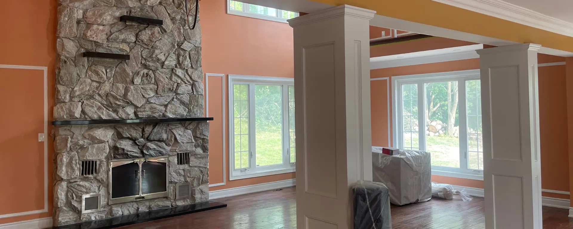
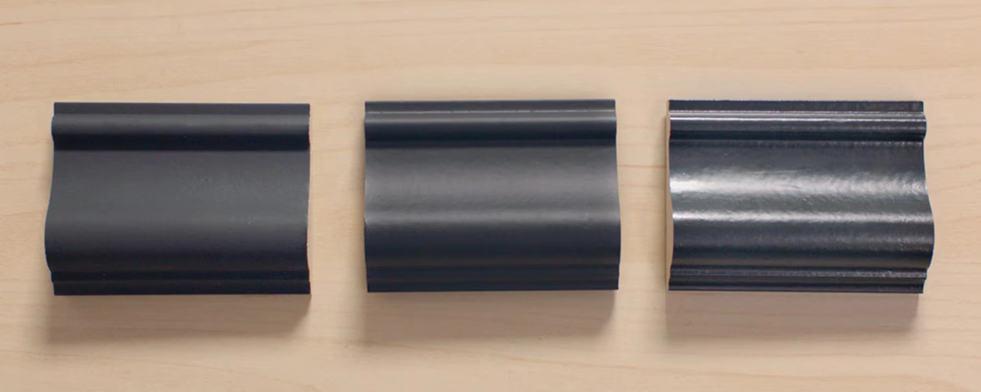
How to Match Paint with Architectural Style
Learn how to match paint with your home’s architectural style discover timeless color pairings that enhance character, balance design, and boost curb appeal.


Learn how to match paint with your home’s architectural style discover timeless color pairings that enhance character, balance design, and boost curb appeal.

2025 marks a new era of collaboration discover why strategic partnerships between trades are key to stability, growth, and smoother construction projects.
Learn how to spot early signs it’s time to repaint peeling, fading, cracks, and stains can signal wear. Keep your home fresh and protected with timely updates.
PPG sells its U.S. and Canadian architectural coatings business to American Industrial Partners, reshaping paint brands, pricing, and supply across North America.
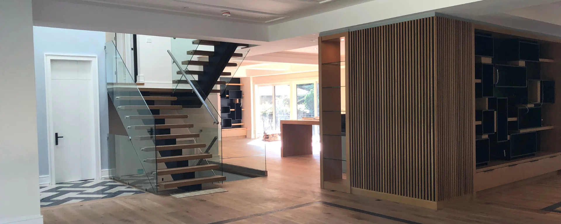
Master surface preparation before painting learn pro tips for cleaning, sanding, patching, and priming to achieve flawless, long-lasting paint results every time.
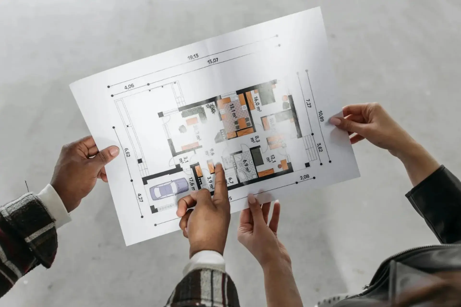
Discover how to calculate paint quantity accurately for any project save money, avoid waste, and ensure perfect coverage with these simple professional tips.
Discover creative ways to use bold colors in your space learn how to balance vibrant tones with neutrals to create depth, personality, and modern style.
Understand paint sheen differences learn how matte, eggshell, satin, semi-gloss, and gloss finishes affect look, durability, and the best spaces to use each.
Unravel the complexities of house painting costs with our detailed guide. Discover what factors influence both interior and exterior painting expenses and how to budget for your project.
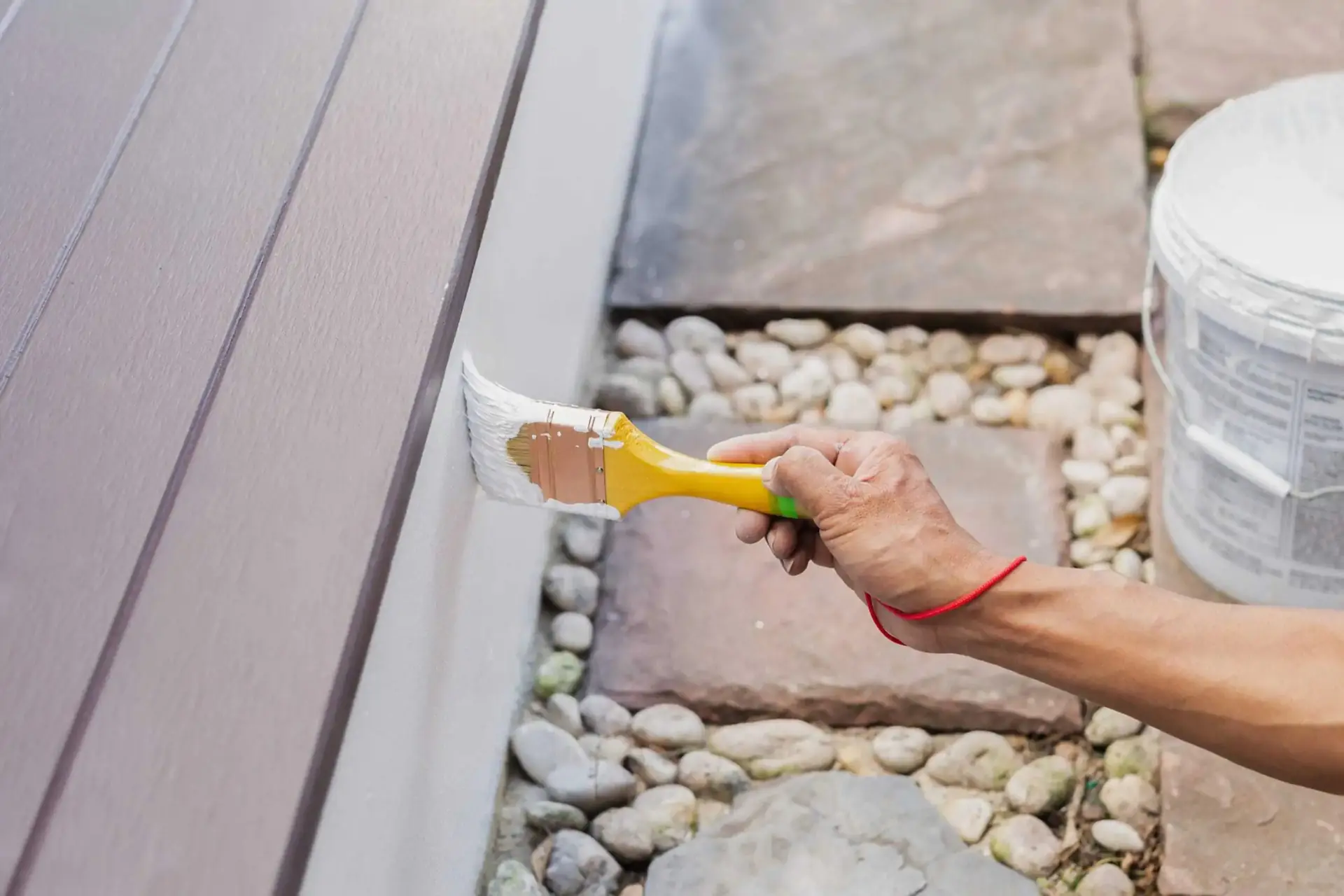
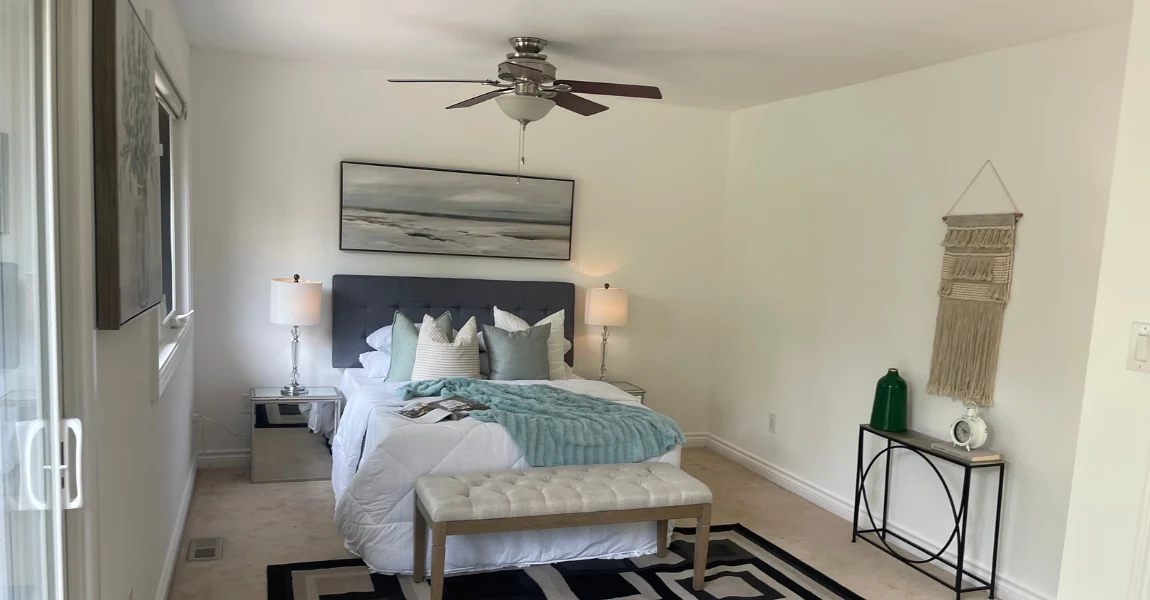
Master the art of exterior house painting with our ultimate guide. From selecting the right paint to surface preparation and application, transform your home’s exterior into a masterpiece.